


One of the biggest goals for any business is attracting new customers. However, getting started with online lead generation can feel overwhelming. With so many marketing channels, tools, and strategies available, it's difficult to know where to invest your time and budget.
The good news is that successful lead generation doesn't require doing everything. It requires focusing on the channels that reach the right audience at the right time.
Whether you're a startup, SME, or established company in Singapore, the right digital marketing strategy can help you generate qualified leads, increase enquiries, and grow your business consistently.
Today, businesses that win aren't always those with the biggest marketing budgets—they're the ones that appear where their customers are searching.
Why Lead Generation Is Different in 2026
The way people discover and choose businesses has changed dramatically. Modern buyers are more informed, have more options, and expect instant answers before contacting a company.
Businesses that fail to adapt risk losing potential customers before the conversation even begins.
Buyers Research Before They Contact You
Today's customers rarely make decisions immediately.
Instead, they:
- Search Google for solutions
- Read online reviews
- Compare competitors
- Watch YouTube videos
- Ask AI tools like ChatGPT or Google AI Overviews for recommendations
By the time someone submits an enquiry, they've often already shortlisted the businesses they trust.
That's why your business needs visibility during the research stage—not just when customers are ready to buy.
Quality Leads Matter More Than Quantity
Generating hundreds of leads means very little if most never become customers.
Ten highly qualified leads are far more valuable than one hundred unqualified enquiries.
Effective lead generation focuses on:
- Reaching the right audience
- Delivering the right message
- Tracking which leads become paying customers
When your marketing attracts better-qualified prospects, your sales team spends less time chasing poor leads and more time closing deals.
Best Digital Marketing Channels for Lead Generation
Every business is different, but these channels consistently deliver strong results for businesses in Singapore.
1. SEO – Attract Customers Already Searching
Search Engine Optimisation (SEO) helps your website appear when potential customers search for products or services online.
Unlike advertising, SEO attracts people who already have buying intent, making them more likely to convert.
A successful SEO strategy focuses on:
- Publishing helpful content
- Targeting keywords customers actually search
- Improving website speed
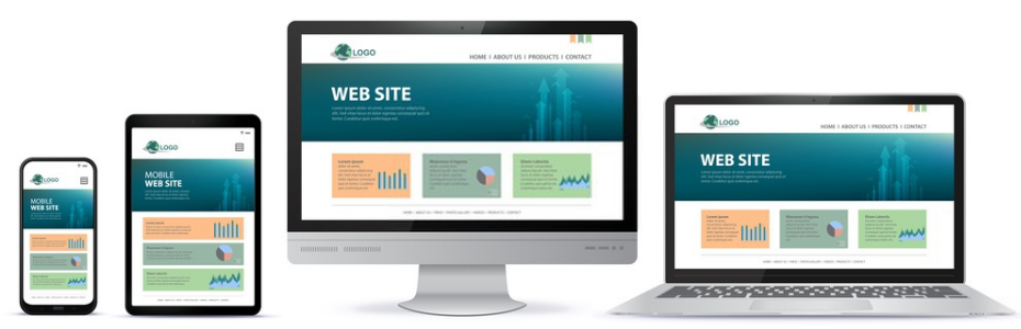
- Creating a mobile-friendly experience
- Building authority over time
Although SEO takes time, it delivers long-term traffic without paying for every click.
Understanding SEO, SXO, AEO and GEO
Modern search goes beyond traditional SEO.
SEO (Search Engine Optimisation)
Optimises your website to rank higher in Google and Bing search results, increasing qualified organic traffic.
SXO (Search Experience Optimisation)
Combines SEO with user experience by improving page speed, navigation, readability, and conversions after visitors arrive.
AEO (Answer Engine Optimisation)
Optimises content so search engines and AI assistants can present your website as the direct answer through:
- Featured snippets
- Voice search
- Google AI Overviews
GEO (Generative Engine Optimisation)
Helps AI platforms like ChatGPT, Gemini, Claude, and Perplexity understand, trust, and reference your business when generating answers.
Businesses investing in both SEO and GEO are better positioned for the future of search.
2. Social Media Marketing
Social media has evolved beyond brand awareness.
Platforms like:
- TikTok
can generate valuable enquiries when used strategically.
Rather than simply posting promotional content, businesses should:
- Share educational posts
- Answer common customer questions
- Publish customer success stories
- Run polls and interactive content
- Respond quickly to comments and messages
For B2B companies, LinkedIn often delivers the strongest results.
For B2C businesses, Facebook and Instagram remain highly effective.
Consistency is the key to building trust and staying top of mind.
3. Paid Advertising
Paid advertising delivers immediate visibility.
Google Ads and paid social campaigns can generate enquiries within hours instead of waiting months for SEO to gain momentum.
Successful campaigns depend on:
- Accurate audience targeting
- Compelling ad copy
- Relevant landing pages
- Clear calls-to-action
- Continuous testing and optimisation
Even small improvements in conversion rates can significantly increase return on investment.
Build a Lead Generation Funnel That Converts
Generating traffic is only the first step.
A structured lead funnel guides potential customers from discovering your business to becoming paying clients.
Stage 1: Awareness
The goal is visibility.
SEO, paid advertising, social media, and content marketing introduce your business to potential customers.
Instead of selling immediately, provide useful information that encourages people to learn more.
Examples include:
- Blog articles
- Educational videos
- Industry guides
- Helpful social media posts
Stage 2: Consideration
Once people know your business, you need to build trust.
This is where valuable content becomes essential.
Effective trust-building assets include:
- Case studies
- Client testimonials
- Industry insights
- Email newsletters
- Downloadable guides
- Checklists
The more value you provide, the more likely prospects are to choose your business when they're ready to buy.
Stage 3: Conversion
Your website should make it as easy as possible for visitors to take action.
Best practices include:
- Short enquiry forms
- Clear calls-to-action
- Fast-loading pages
- Mobile-friendly design
- Dedicated landing pages for each campaign
Reducing friction at this stage can dramatically increase conversion rates.
Lead Generation Metrics That Actually Matter
Tracking the right metrics helps you improve marketing performance over time.
Instead of focusing on vanity metrics like page views or follower counts, measure the numbers that directly impact revenue.
Cost Per Lead (CPL)
Cost Per Lead measures how much you spend to generate each enquiry.
Monitoring CPL helps you:
- Compare marketing channels
- Allocate the budget more effectively
- Improve marketing ROI
Lead Quality Score
Not every lead has the same value.
Lead scoring ranks prospects based on factors such as:
- Industry
- Job title
- Company size
- Website activity
- Purchase intent
This helps sales teams prioritise the leads most likely to convert.
Conversion Rate
Conversion rate measures the percentage of visitors or leads who become customers.
If conversion rates are low, review your:
- Landing pages
- Offer
- Follow-up process
- Website experience
- Call-to-action
Small improvements in conversion rates often produce significant increases in revenue without increasing marketing spend.
Why Businesses in Singapore Need an Integrated Digital Marketing Strategy
Successful lead generation isn't about relying on one marketing channel.
The best-performing businesses combine multiple strategies, including:
- SEO
- Local SEO
- Google Ads
- Social Media Marketing
- Content Marketing
- Email Marketing
- AEO
- GEO
Together, these channels help businesses attract customers throughout every stage of the buying journey.
Final Thoughts
Digital marketing offers businesses of every size the opportunity to generate consistent, high-quality leads.
The key isn't trying every marketing tactic at once—it's selecting the right channels, building an effective lead generation funnel, and measuring the metrics that truly matter.
Start with one or two marketing channels, optimise what works, and gradually expand your strategy.
For businesses in Singapore looking to increase enquiries and improve online visibility, partnering with an experienced digital marketing agency like Awebstar Technologies can help you build a results-driven strategy that combines SEO, Google Ads, Social Media Marketing, AEO, and GEO to generate sustainable business growth.
With the right strategy and consistent optimisation, even businesses with modest marketing budgets can compete successfully and generate qualified leads year after year.